5 Example Data Analysis
To show my skills working with basic datasets I have imported data from a C. elegans experiment and have made a few graphs based on this data. The dataset was provided by J. Louter (INT/ILC)
First thing is loading in some needed libraries and the data itself
library(readxl)
library(tidyverse)
library(here)
library(DT)
To import the data I used the “read_excel()” function in combination with the “here()” function. The read_excel function is used to import excel files to an object, this object can now be used to call the dataset. The here() function is used to assign the path to the file wich is imported, in this case the data is stored in the data folder.
I first looked at the data that was provided, there are 360 rows of data. In the next table the data is visible. This datatable is shown using the “datatable()” function, I set the option scrollx to true, because of this it is possible to scroll through all the data.
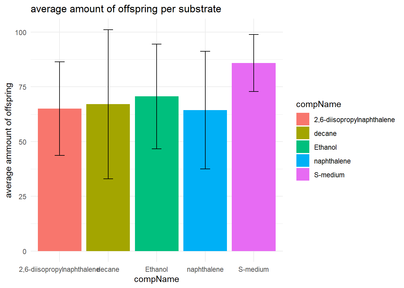
I also made a table showing some descriptive statistics of the data using the summarise function.
With the help of this table I made a bar graph for better visualisation of the descriptive statistics
# load the data in a datatable
datatable(data, options = list(scrollx=TRUE))
# summarise some descripte statistics
data_summary <- data %>% group_by(compName) %>% summarise(mean = mean(RawData, na.rm = TRUE), sd = sd(RawData, na.rm = TRUE), minimum = min(RawData, na.rm = TRUE), maximum = max(RawData, na.rm = TRUE))
# here I loaded the data for visibility in the markdown file
datatable(data_summary) %>% formatRound(columns=c('mean', 'sd'), digits=2)# plotting the descriptive statistics
data_summary %>%
ggplot(aes(x = compName, y = mean, fill = compName)) +
geom_bar(stat = "identity") +
theme_minimal() +
geom_errorbar(aes(x = compName, ymin=mean-sd, ymax=mean+sd), width = 0.2) +
labs(
title = "average amount of offspring per substrate",
y = "average ammount of offspring"
)
After I imported the data I looked at which classes where assigned to the variables. Most variables where imported correctly. compConcentration was imported as a character but it was a number. So I changed the class to numeric using the “as.numeric()” command.
I plotted the data using ggplot, where I used the compConcentration as the x-axis and the amount of offspring as the y-axis.
#compConcentration in numeric veranderen
data$compConcentration <- as.numeric(data$compConcentration)

#grafiek maken
ggplot(data = data, aes(x = compConcentration, y = RawData)) +
  geom_point(aes(color = compName,
                 shape = compName))+
  labs(title = "Number of offspring per concentration",
       y = "Number of offspring",
       x = "Concentration of compound") +
  theme_minimal()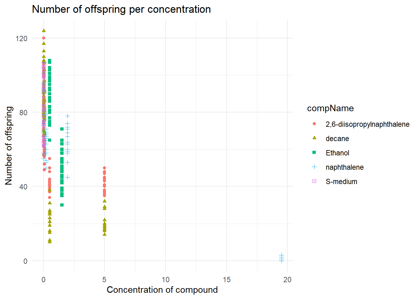
Because I changed to compConcentration variable to numeric the x-axis data is readable, otherwise it would have been impossible to read because there would be a lot of text clutter on the x-axis.
But the data is still not easy to analyse, because of this I have normalized the data in the following command with a log10 transformation. I also added some geom_jitter to make sure that the data does not overlap.
#compConcentration in numeric veranderen
data$compConcentration <- as.numeric(data$compConcentration)

#grafiek maken
ggplot(data = data, aes(x = log10(compConcentration), y = RawData)) +
  geom_jitter(aes(color = compName, shape = compName),width = 0.08)+
  labs(title = "Number of offspring per concentration",
       y = "Number of offspring",
       x = "log10 Concentration of compound") +
  theme_minimal()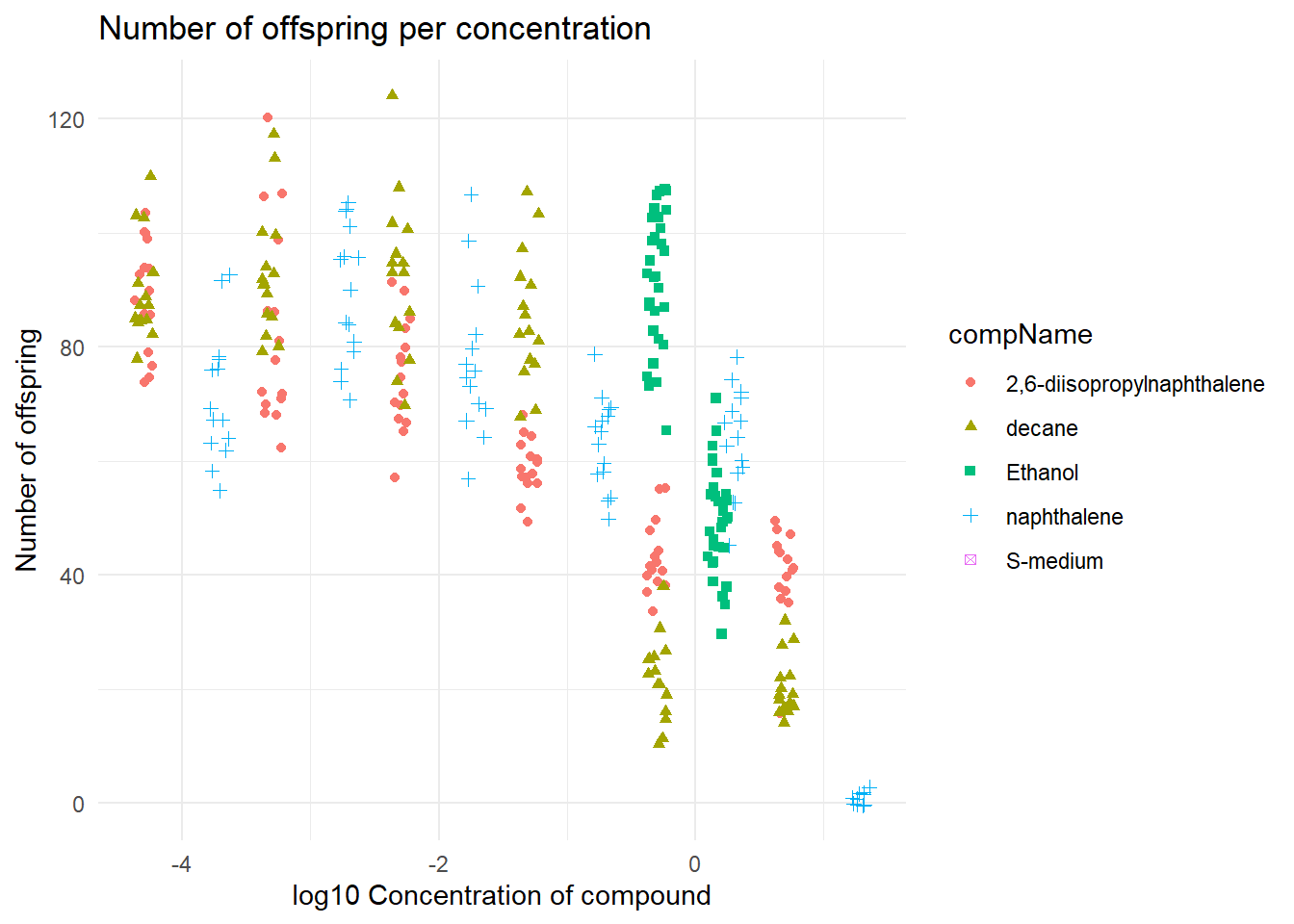
This graph is a bit easier to read, when looking at the data it seems that on a higher concentration of 2,6-diisopropylnapthalene the C. elegans gets a lesser amount of offspring.
The positive control for this experiments is Ethanol. The negative control for this experiment is S-medium.
For a statistical analysis to find out the if there is indeed a difference. I would:
Do a shapiro-wilk test to see if the data has a normal distribution.
Next I would do a levene test to see if there is any variance within the data.
If the data has a normal distribution I would do a T-test to see if there is any significant difference. The T-test would use the positive control group and another substance.
In the last plot I normalised the data with the help of a the mean of the negative control. This is useful because now the negative control has no effect on the data itself.
I first filtered so that it only uses data from the negative control using the “filter()” function. After this I calculated the mean ammount of offspring from the negative control experiment. Using this mean I could normalise the data and make a graph out of it.
#data filteren op de negatieve controle
data_negative <- data %>% filter(data$expType == "controlNegative")

#De gemiddelde berekenen van het rawdata colom van de negative controle
mean_negative <- mean(data_negative$RawData, na.rm = TRUE)

#De data normaliseren op basis van het gemiddelde van de negatieve controle
data$RawData <- (data$RawData/mean_negative)*100

#grafiek maken
ggplot(data = data, aes(x = log10(compConcentration), y = RawData)) +
  geom_jitter(aes(color = compName, shape = compName),width = 0.08)+
  labs(title = "Number of offspring per concentration Normalised",
       y = "Normalised amount of offspring (%)",
       x = "log10 Concentration of compound") +
  theme_minimal()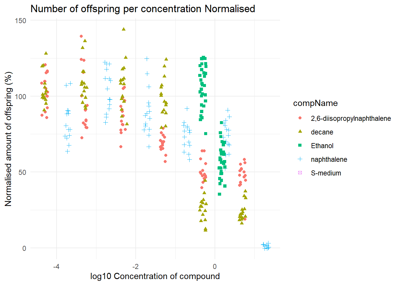
In this graph you can see clearly that there is indeed a negative corralation with the 2,6-diisopropylnapthalene concentration and the amount of offspring. To know if there is a statistical significant difference a T-test could bee used.